25 Key Metrics for a Product Management Dashboard
Product Managers collaborate with almost all parts of a software enterprise. They need fact-based insights to explain how their products are performing. This post explores 25 key metrics that product managers should include in their product dashboards. As Peter Drucker said, “If you can’t measure it, you can’t improve it.”
This post is divided into four major sections:
- Dashboard Overview. A quick review of the 25 metrics that could be included in the dashboard
- Liqlytics Case Study Overview. A case study of a fictitious four year old company that sells marketing automation, CRM, analytics, and social media publishing solutions is used as the basis for most of the metrics in this post.
- Metric Definitions and Examples. Definitions/formulas that can be used to calculate the various metrics as well as examples of the actual metric.
- Building Your Product Management Dashboard. Suggestions and guidance on how you can build, launch, and maintain your own product management dashboard
Dashboard Overview
An effective product management dashboard can be divided into the five sections and is composed of 25 metrics:
1. Corporate
1.2 Customer Acquisition Cost (CAC)
1.3 LTV/CAC
1.4 CAC Payback
1.7 Customer Tiering
1.9 Churn Analysis
2. Sales
2.1 Booking Trends
2.2 Sales Rep Performance vs Quota
2.3 Sales Rep/Product/Moneywheel
3. Customer Service
3.1 Key Stats
3.2 Customer Service Ticket Type & Severity
3.3 Customer Effort Score (CES)
4. Marketing
4.2 Search Console Performance
4.3 Ad Performance
4.4 Marketing Funnel Performance
5. Development
5.2 Agile Velocity
5.3 Burndown Chart
5.5 Escaped Defect
Liqlytics Case Study Overview
In this post, we will review a metrics dashboard for a mythical company known as Liqlytics – a four-year-old startup that provides sophisticated marketing automation, CRM, analytics, and social media publishing tools for producers of alcoholic beverages like Jack Daniels, Stoli, and Hennessey.
Liqlytics spent its first year in stealth mode building out its core marketing automation and CRM platforms in conjunction with a cohort of early adopters. It launched after year one, and in year two expanded its product portfolio to include a purpose-built analytics platform and a social media publishing add-on. The company is headquartered in Atlanta, Georgia, and is primarily focused on the U.S. market. It has a direct enterprise sales force and is heavily reliant on Internet advertising and organic search for lead generation.
Liqlytics’ revenue growth has stalled out after a very successful first year. Liqlytics sells two core products – marketing automation and CRM as well as two add-on products – Analytics and Social Publishing. Products are priced on a per-user basis with volume discounts. Contracts are for one to three years with non-cancellable monthly minimums. The longer the contract, the greater the discount. Salespeople also discount deals in special situations like desirable new logo references or end-of-the-quarter/year deals to make quota.
To develop a fact-based understanding of what is going on in their product lines, Liqlytics’ product managers decided to build a dashboard that they could use on a daily basis to support decision making.
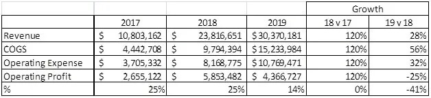
To put the business in perspective, here is a summary profit & loss statement for Liqlytics:
Metric Definitions and Examples
Lifetime Value (LTV)
One of the first metrics the team decided to track was Life Time Value (LTV). LTV answers the question “what is a typical customer worth to us?” There are several different formulas that can be used to calculate LTV. The most popular is:
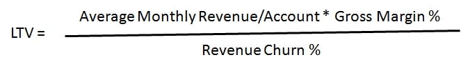
Average monthly revenue per account is the average monthly billings for a customer, gross margin % is the overall gross margin of the business (or product line if available), and revenue churn % is the average monthly dollar churn of the product.
There are a couple of challenges to this approach to LTV. First, it focuses on average monthly revenue per account. If your enterprise has been in business for a short time, this approach makes sense. If like Liqlytics it has been in business for significantly longer than the average customer lifetime, this formula tends to understate LTV. Another challenge is how the company defines gross margin. Gross margin is equal to revenue minus the cost of revenue. Unfortunately in the SaaS industry, there is no consistent definition of what constitutes the cost of revenue. Some items are straightforward like sales commissions, Internet ad spend, and telecom expense. Others are not so clear like data center equipment depreciation, customer support, the cost of marketing content creation, fees for industry analyst services (especially where opinions like Gartner & Forrester have a significant impact on customer buying decisions.)
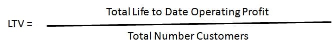
Instead of focusing on gross margin, companies should use operating profit or net income. Operating profit encompasses all of the direct and indirect costs associated with producing revenue. It is readily available from standard financial statements and consistently calculated from period to period. A simpler and more accurate formula for Liqlytics would be:
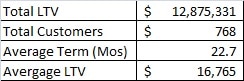
In the case of LiqLytics, their LTV is $16,765. In other words, a typical customer is going to deliver $16,765 in operating profit to Liqlytics over its lifetime. For a frame of reference, the average life of a Liqlytics customer is 22.7 months.
Customer Acquisition Cost (CAC)
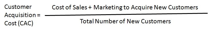
CAC is how much a company spends to acquire a new paying customer. The basic formula is pretty simple:
For a company with a single product operating in startup mode where almost all customers are new customers and all marketing and sales activities are geared toward new customers, this formula works.
For companies that have been in business for a few years with multiple product/service lines, it gets significantly more complicated. How do you consistently determine the allocation of marketing spend to new customers versus maintaining revenue from existing customers? The same holds true for sales expenses. Another complicating factor is that over time, the percentage of total revenue new customers contribute tends to decline while revenues from existing customers tend to increase as a percentage of total revenues.
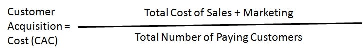
At its heart, this metric is about efficiency – how much do you have to spend to acquire customer revenue? A more appropriate metric for a mid-to-late stage firm is the cost to acquire all revenue. Consider the following formula:
This metric will change over time as the total number of paying customers grows. Here is a three-year look at Liqlytics CAC using this formula:
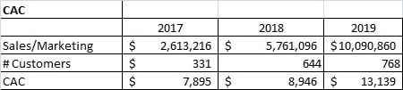
An interesting point to study would be the rate at which revenue has grown and CAC has grown? Are they in sync or is there an issue?
LTV/CAC
The LTV/CAC ratio helps an enterprise to understand if they are under or over-investing in sales and marketing. The formula is simple:

The result is a ratio, like 4:1x. A ratio of 1:1 or less means that a firm is spending more to acquire a customer than the customer is expected to contribute over its lifetime. Ratios of 3:1 or 4:1 are considered to be good or excellent. Liqlytics LTV/CAC is:
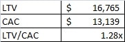
Liqlytics LTV/CAC has declined over the three years they have been tracking it. There are two factors impacting it, the dramatic decline in revenue growth and the disproportionate growth in sales and marketing expenses.
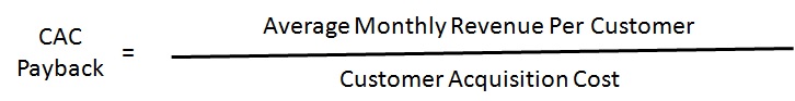
CAC Payback
CAC Payback is the amount of time it takes for an average customer to generate enough revenue to pay back the cost of acquiring the customer, usually expressed in terms of months. The formula is simple:
CAC Paybacks less than 12 months are considered to be acceptable. The closer to one month payback is better. Liqlytics CAC Payback is:
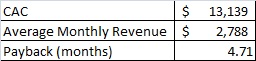
There is a significant variation in average customer monthly revenue for Liqlytics. It ranges from $113 to over $10,500. We will discuss the effects of revenue tiers later on.
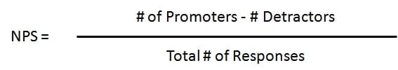
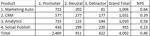
Product Net Promoter Score (NPS)
Net Promoter Score is a management tool that can be used to gauge the loyalty of a firm’s customer relationships. It serves as an alternative to traditional customer satisfaction research and is claimed to be correlated with revenue growth. NPS has been widely adopted with more than two-thirds of Fortune 1000 companies using the metric. NPS measures the strength and quality of relationships, not transactions. NPS asks customers to rate a firm on a scale of 1 (very unlikely) to 10 (very likely) on how likely they are to recommend the firm to others. Responses are grouped into three categories: Promoters (9-10), Neutrals (7-8), and Detractors (1-6). Here is how the Net Promoter Score is calculated:
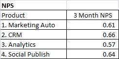
A score of 0.5 is considered to be very good, above 0.7 is excellent. For Liqlytics, NPS is captured three months after go-live for each product line:
NPS is a very popular metric for several reasons. First, it is easy to administer, respondents are more likely to respond to a one-question survey than a 15 question survey. It is easy to calculate and it is applicable to a wide variety of situations from customer satisfaction to rating the performance of organizational units inside your enterprise.
NPS has its detractors. The first challenge raised is one of statistical significance – is the set of people who respond to the survey truly statistically significant? Email surveys tend to produce response rates of 4% to 7% of the population. That sample size might not be large enough to be statistically significant. The second challenge is that NPS measures the intent of the respondent – not definitive action. Did the respondent actually recommend your firm to a friend or colleague? Did that person actually investigate your firm? Did they make a purchase? Did the recommendation play a significant role in the purchase decision? NPS has been loosely correlated with revenue growth but has shown to have a statistically significant impact on expansion revenue.
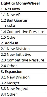
Customer Moneywheel
The Moneywheel is a revenue sourcing analysis technique that helps organizations discover and scale repeatable types of sales transactions. For almost every product there is a set of events that occur in the marketplace that trigger a prospect’s interest in purchasing a solution. Understanding these events can help focus demand generation and sales campaigns.
A typical Moneywheel is divided into five broad sections:
- Net New Revenue. Revenue from net new customers
- Expansion Revenue. Revenue from existing customers expanding their usage of a product through either more users or more organizational units
- Add-on Revenue. Revenue from the sale of Add-on products to existing customers
- Migration Revenue. Paid migration from one version of a solution to another version. This is the least common category and often not relevant to an organization
- Financial Deals. Revenue from deals that are primarily financially driven like site licenses, test/disaster recovery licenses, or usage audits
Each category can be further subdivided into a number of ‘spokes’. Each spoke represents an event that occurs in the marketplace that drives a prospect to begin the process of considering the purchase of a solution. This table describes the categories and spokes for Liqlytics:
When Liqlytics looked at their historical sales transactions they found 12 patterns of similar sales transactions. For example, for net new customers, they found that when a firm hired a new VP of Marketing there was a good chance that person would consider a new marketing automation solution. Additionally, they learned that if a prospect had recently experienced a bad quarter from a sales perspective, they were significantly more receptive to acquiring a new marketing automation solution. To learn more about how to identify these types of events, check out Product Managers: Change the Top of the Sales Funnel: Trigger Driven Prospecting.
Here is a complete version of Liqlytics’ Moneywheel:
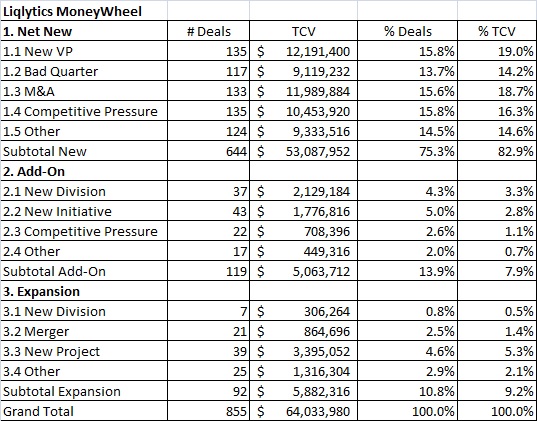
The Moneywheel can be used to analyze sales transactions, territory performance, and sales team/sales rep performance, and to plan demand generation campaigns. To learn more about the Moneywheel concept check out Moneywheel – A Revenue Sourcing Analysis Technique for Product Managers.
Customer Revenue Tiering
Not all customers contribute the same revenue to the enterprise. This is especially true for SaaS customers. Understanding the relative contribution each customer makes is critical for product managers. Revenue tiering is an analytical technique that can help product managers understand how each customer contributes to the business. Here is a summary revenue tiering analysis for Liqlytics:
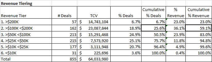
As the chart indicates, tier 1 and tier 2 customers contribute almost 60% of Liqlytics revenue, while the bottom two tiers contribute less than 5.3%. It is more helpful to look at the analysis on a product basis:
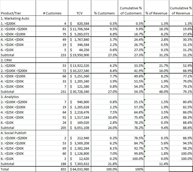
As the table indicates a small cohort of customers is responsible for the majority of the revenue. Specifically, the top two tiers for the Marketing Automation and CRM products account for 32% of all customers, but over 64% of all revenue. This data can help product managers prioritize development efforts and provide clues to where the most valuable sales opportunities lie. To learn more about tiering check out Why Pareto Analysis is Important for Product Managers
Bookings versus Revenue
Another trend to monitor is bookings versus Revenue. Bookings, or customer commitment, are often known as Total Contract Value (TCV). TCV is the total minimum non-cancellable payments a customer commits to over a specific contract term. Revenue is the amount billed to customers each month. Here are the Bookings versus Revenue chart for Liqlytics over the three years they have been in production:
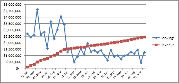
An interesting question that product managers should understand is what happened to total bookings after the first year?
Customer Churn Analysis
Customer Churn Analysis looks at the number and value of customers who cancel their subscription in a given time period. Since customers start their service at different points in time and contract for different periods of time, the best way to look at cancellations is in the context of monthly customer revenue. Here is the cancellation summary for Liqlytics for 2019:
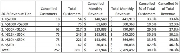
You can also look at cancellations in the context of the customer’s original term commitment:
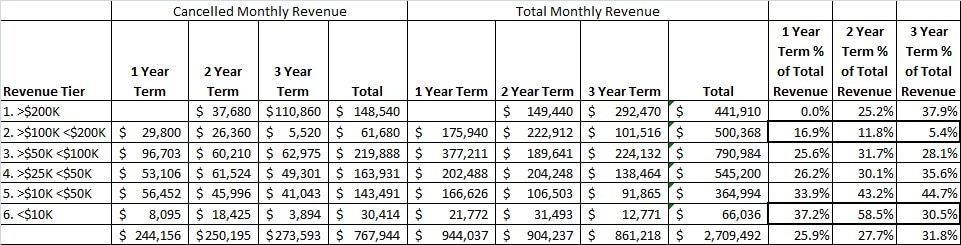
You could also slice the data by Moneywheel category/spoke, by product, or even by sales rep/geography. Solid best-practice product managers should implement is Win/Loss Analysis. While metrics can tell you what happened, they do not provide insight into why it happened. To learn more about Win/Loss Analysis, check out the Win/Loss Agency.
Booking Trends
Another key metric is booking trends. Bookings are the money customers commit to at the time of sale. Liqlytics uses 1, 2, or 3-year term contracts with guaranteed monthly minimums. This approach is often known as Total Contract Value. Many companies require no commitment. In those cases, bookings are estimated based on typical customer lifetime expectations. Below is a chart that illustrates Liqlytics’ monthly bookings over three years:
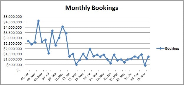
An interesting question for product managers to ask is why did bookings decline so dramatically between year 1 and year 3?
Sales Rep Performance vs Quota
Product Managers should understand, at a summary level, how well each sales rep and region is doing in comparison to their assigned quota:
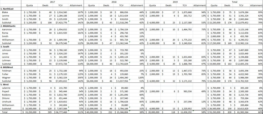
Not all sales reps are created equal. It helps a product manager to understand which reps are being successful and which are struggling. The tactics and behaviors of the successful reps can be used to help lift the performance of the reps that are struggling.
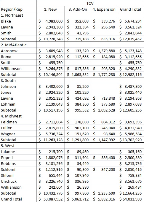
Sales Rep Moneywheel Performance
You can also slice the data by other dimensions like the length of the contract, product, revenue tier, or Moneywheel Category/Spoke. Here is a summary of rep TCV bookings by Moneywheel Category:
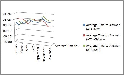
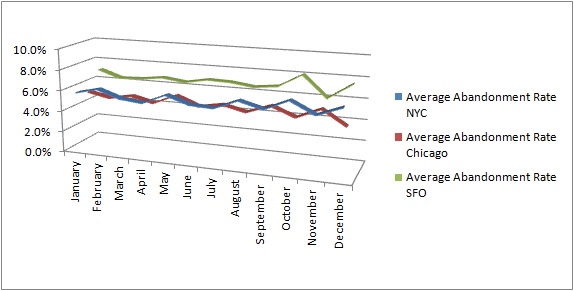
Customer Service stats are an important source of information for product managers. Most customer service organizations track a set of standard metrics. A few for Liqlytics include Inbound Contact Volume, Average Time to Answer, Abandonment Rate, and Elapsed Time to Resolution. These metrics give product managers a general understanding of how well, or poorly, the customer service team is performing.
Customer Service Stats

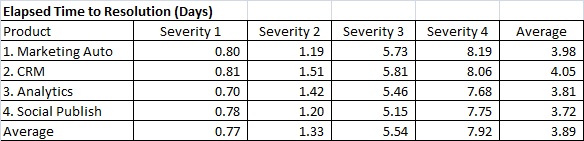
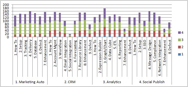
Customer Service Ticket by Case Type & Priority
The types and severity of customer issues provide product managers with critical insights into their product’s performance and priorities for development to consider. Here is a breakdown for Liqlytics:
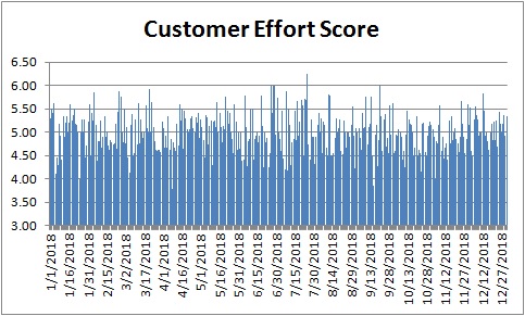
Customer Effort Score (CES)
Customer Effort Score is the measures the ease of an experience with a company by asking customers, on a five-point scale of “Very Difficult” to “Very Easy,” how much effort was required on the part of the customer to use the product or service to evaluate how likely they are to continue using and paying for it. It is a slightly more complicated approach than NPS. Customers can rate their experience on a scale of 1 to 7, with 1 = Very Difficult and 7 = Very Easy. Ideally, your firm wants an average CES greater than 3.5. Below is a chart of Liqlytics daily Customer Effort Score:
Customer Service NPS
NPS can also be used to assess customer service performance. NPS surveys are usually taken immediately after a service request has been completed. Here is a table with NPS scores for each of Liqlytics customer service locations:
Standard Web Analytics Reports
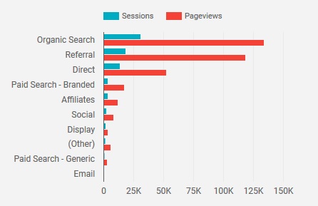
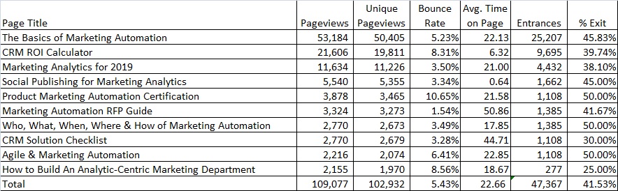
Web Analytics provides product managers with insight into the effectiveness of product marketing activities. There are literally dozens of standard reports product managers can review. Some of the more common reports include traffic trends, traffic sources/mediums, page performance, search terms, etc.
Session Trends
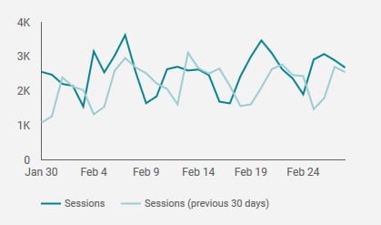
Sources
Page Performance
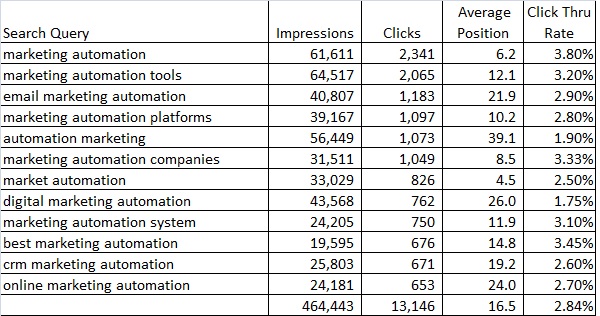
Search Console
Google Search Console is an extremely valuable free resource from Google. It shows the organic search terms users used to find content on your website, how many times specific URLs appeared in searches, how many times users clicked on your content, and relatively where your content appeared in a search result (i.e. page 1, position 12). This type of reporting gives product managers an ‘outside-in’ perspective for how customers and prospects are searching for solutions, and how your company’s content is performing. This is critical information when designing and evaluating demand generation campaigns. Here is a summary of Liqlytics search console results:
Ad Performance
If your firm uses paid ads to drive traffic, product managers should review how well the ads are performing. Again, this will provide insights into what potential customers are searching for and how effective their company’s ad campaigns are performing.
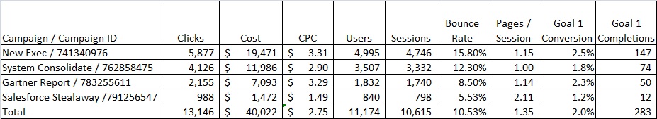
Marketing Funnel Performance
Almost all CRM systems provide a mechanism for visualizing the marketing funnel. Here is an example from Salesforce.com:
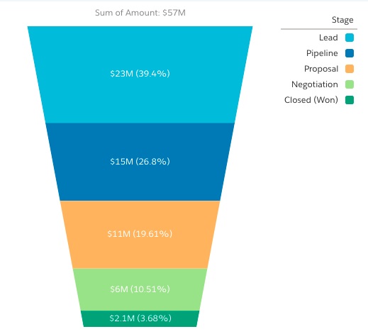
Product Managers should understand the structure and velocity of movement through their company’s marketing funnel. Here is a table that summarizes Liqlytics marketing funnel performance:
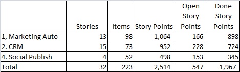
Agile Backlog Summary
Most contemporary development organizations use some type of Agile approach for development and product managers are actively involved in the process, sometimes as product owners. Tracking basic stats about the state of the backlog is helpful.
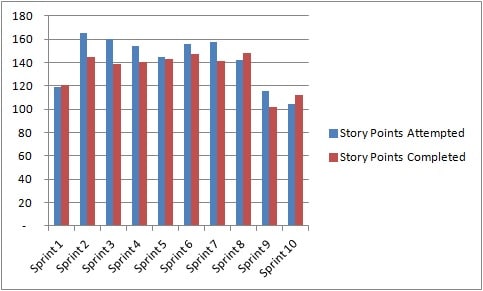
Agile Velocity
Agile Velocity is usually defined as the number of story points completed per Sprint, against what was attempted. Here is a summary of LiqLytics last 10 Sprints:
Sprint Burndown Chart
Burndown charts are standard tools for monitoring progress during a specific Sprint, as shown below:
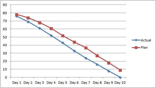
Burndown charts can also be used to monitor the progress of Agile themes, initiatives, and epics as well.
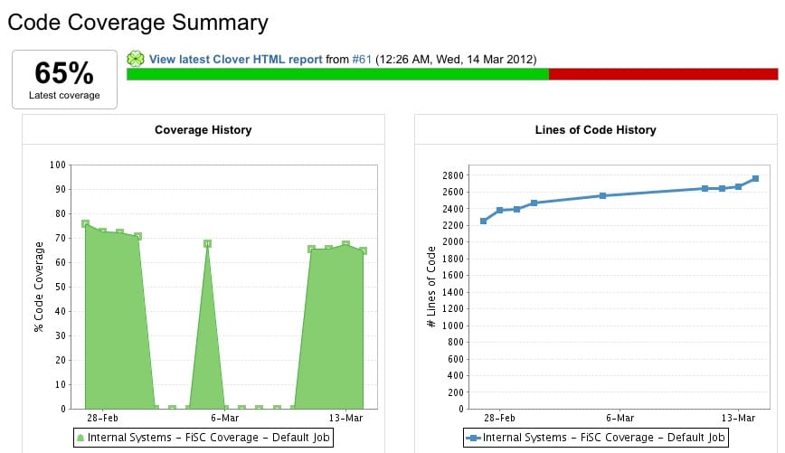
Code Coverage
Code coverage is another standard Agile metric. Below is a code coverage example generated from Jira:
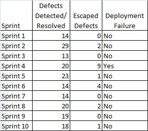
Escaped Defects and Deployment Failures
Two other common Agile metrics are escaped defects and deployment failures. Escaped defects are defects that are detected after a Sprint has been promoted to production. It is often difficult to assign a particular defect to a specific Sprint, but tracking the general trend can help a team better structure and execute QA tasks. Deployment failures are when a done Sprint fails to be successfully deployed into production. These are usually rare occurrences, often tied to build problems, differences between the pre-production and production environments, or fatal defects that escaped detection during regular QA.
Building Your Product Management Dashboard
Metrics are just a part of a product manager’s responsibilities. A typical product manager should spend no more than 5% of their time (2 hours/week) interpreting dashboard data. The focus should be on taking actions based on what was learned from the dashboard. A four-step process is used to build out your product management dashboard:
- Determine Dashboard Objectives
- Select & Define Metrics
- Implement Dashboard Technology
- Implement Dashboard Process
Dashboard Objectives
The process beings with determining the objectives your dashboard will achieve. There is a tendency for product managers to gather and assess data points that are ‘nice-to-know versus ‘have-to-know’. Product managers should clearly define dashboard objectives that directly relate to their sphere of responsibility and resist the temptation to expand their focus across the entire organization.
Metric Definition
The next step is to select and define the metrics that will be included in the dashboard. This post provides examples of 25 metrics that product managers could consider for their dashboards. The selection of metrics should be based on the needs and market conditions product managers face. The needs of a product manager in a SaaS startup are radically different than those for for a mature B2B solution provider
Once the candidate metrics have been identified, the next step is to define how the metrics will be calculated. For example, Customer Acquisition Cost (CAC) can be calculated differently for a B2C firm relying on Google Ads as the primary source of leads versus a B2B focused solution for enterprise customers. The consumers of metric information need to agree on the metric formula. If the head of marketing does not approve of the formula for CAC, the effectiveness and utility of the metric will be extremely limited.
Dashboard Technology
The next step is to develop the technology to gather and present dashboard information. Each functional department like marketing, sales, customer service, development, and finance has core systems in place to produce metric information Most organizations have some type of analytics or business intelligence solutions already in place that can be used to pull data and metrics from these operational systems to fuel a product management dashboard. Alternatively, free solutions, such as Google Data Studio, have built-in data connectors that when coupled with Google Sheets, can produce an effective dashboard quickly and inexpensively.
The time and cost of assembling and analyzing metric information cannot outweigh the benefit of having the information. If it takes more than two hours a week to assemble and interpret metric information, product managers should go back and reassess the objectives and technology used to create and populate their dashboard
Closed-Loop Process
Product managers should implement a closed-loop process to assess and evolve the dashboard. The dashboard should be incorporated into regular product management reporting. Processes should be adjusted to take actions based on dashboard results. On a quarterly basis, the dashboard itself should be assessed to ensure that the metrics being gathered are accurate and relevant. If the cost to obtain a metric outweighs the benefits it brings, it should be eliminated from the dashboard.
Process is as Important as Formulas
You should check out Product Manager Metrics: Process is as Important as Formulas. The process you use to build your product management metrics program is important.
“All parts of the organization that are impacted by a metric must share a common definition of what the metric is, how it will be calculated, and how the results will be interpreted. Marketing, Sales, and Finance may have different views on how LTV could be calculated, but these views have to be reconciled and one definition agreed to. Otherwise, the organization whose views were not addressed will ignore or dismiss the metric. The consequences of not taking corrective actions could be serious.”
That article suggested a six-step process:
- Start with Business Plan goals
- Clarify metric calculations
- Obtain stakeholder consensus
- Assess feasibility and cost/benefit
- Commit to stakeholder action
- Conduct periodic retrospectives
Summary
As Peter Drucker said, “If you can’t measure it, you can’t manage it.” Metrics are critical for product managers. Metrics provide fact-based insights to explain how their products are performing. While the formulas are important, product managers should ot forget that the process they use to build their dashboard is just as important. If the head of marketing does not approve of the formula for CAC, the effectiveness and utility of the metric will be extremely limited.